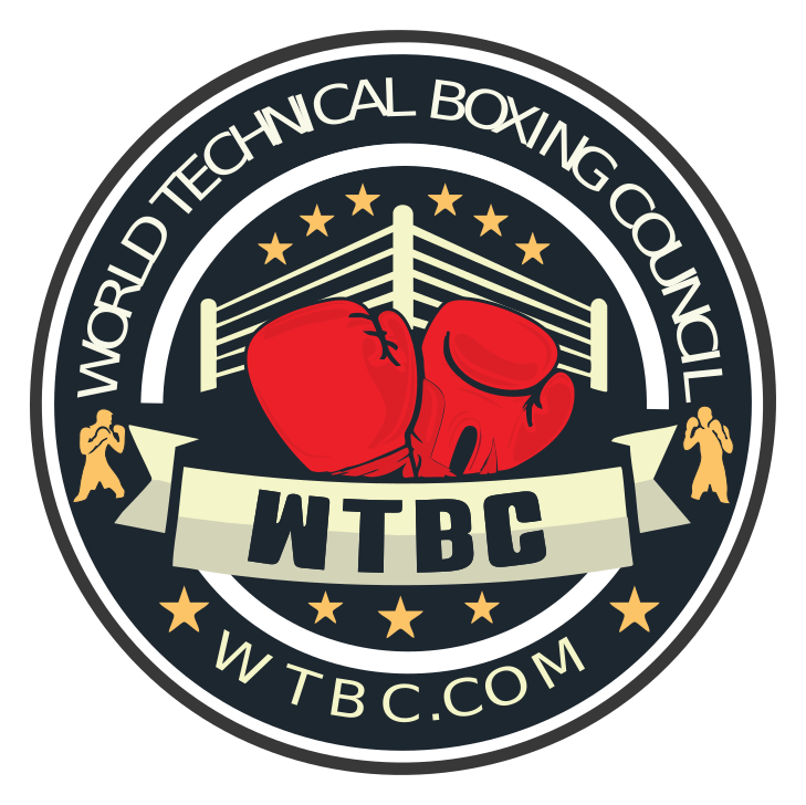
World Technical Boxing Council
A bold, authoritative identity for a modern boxing organization built on precision, discipline and technical excellence.
Back to work- Client
- WTBC
- Year
- 2024
- Scope
- Badge, apparel, event graphics
- Smallest use
- 40 mm patch
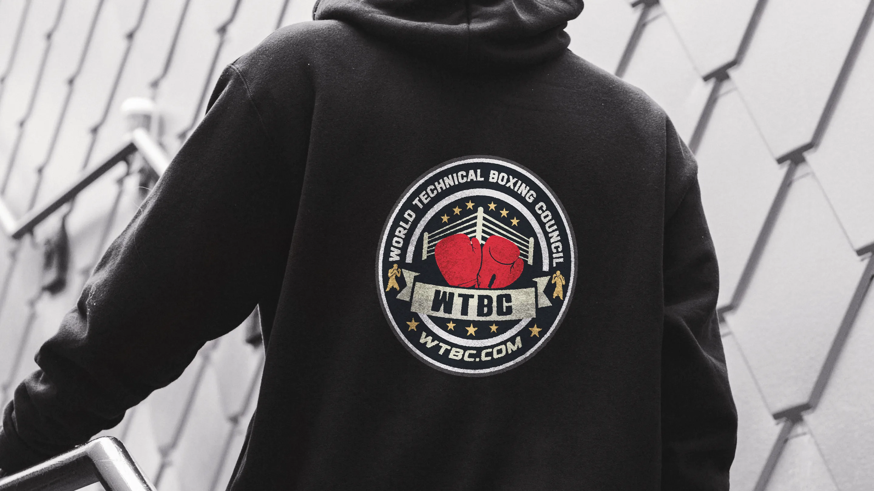
Brand identity development for the World Technical Boxing Council — a modern boxing organization focused on precision, discipline and technical excellence within the sport.
The objective was a bold, authoritative visual identity that reflects the structure and intensity of competitive boxing while staying clean and contemporary. The direction emphasises strength, control and clarity — the qualities that define both the sport and the organization.
The system is built on strong typography, balanced layouts and a refined palette that holds up across platforms. Every element was drawn for consistency, whether it lands on event promotion, digital media or official material.
Versatility was the main constraint: the identity had to scale across formats without losing a recognisable, professional presence — from a 40 mm woven patch to a full back print.
The result positions WTBC as a credible, forward-thinking authority in the boxing world.
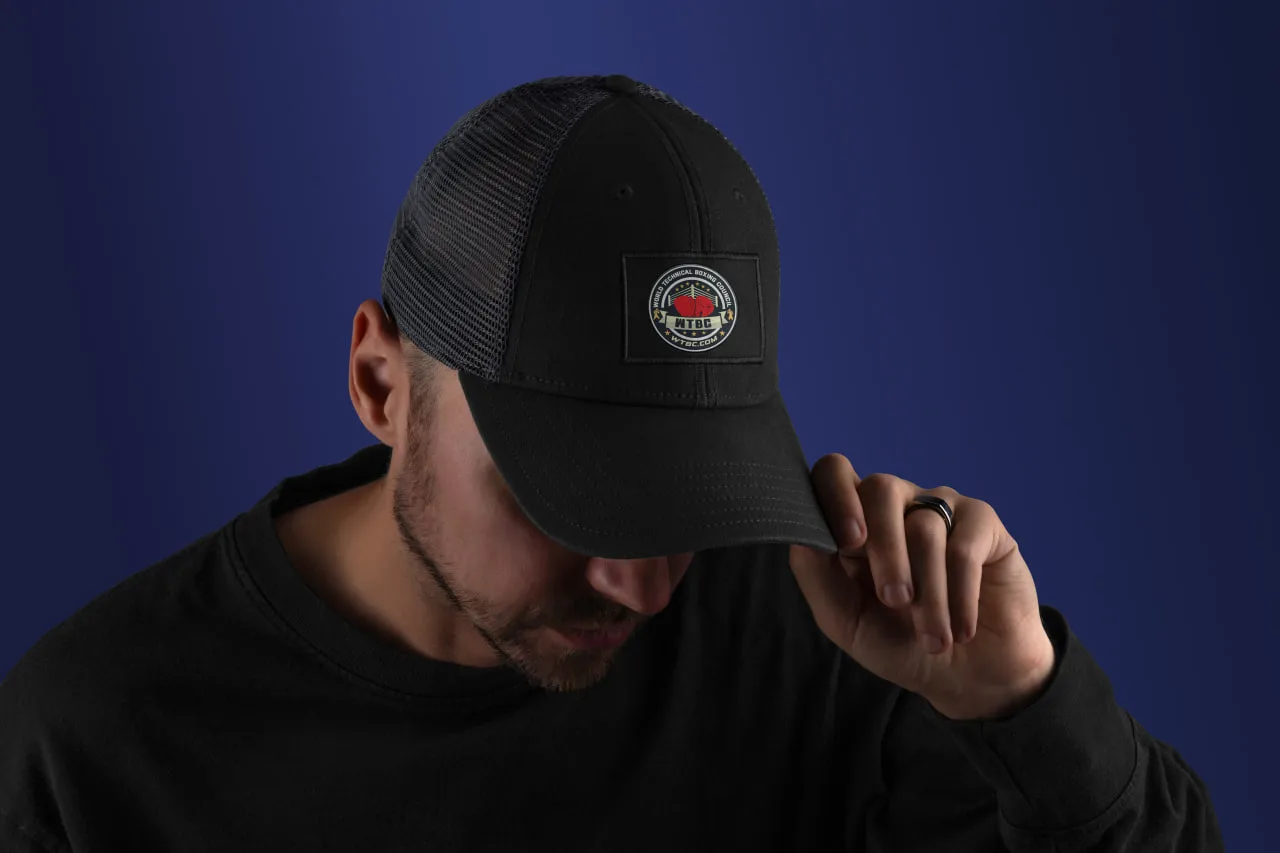

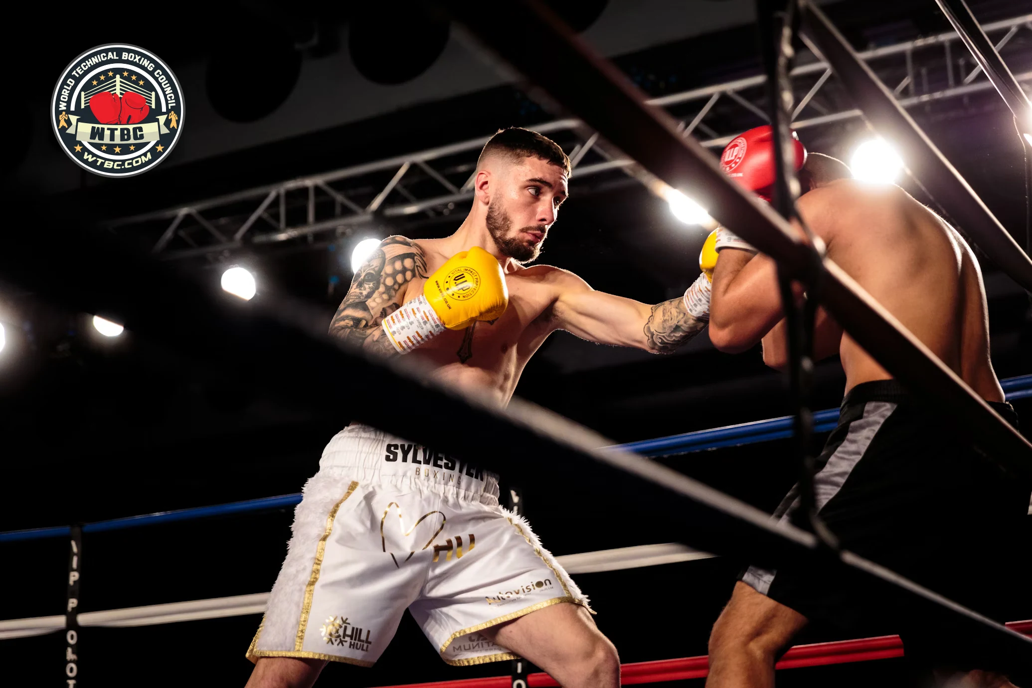
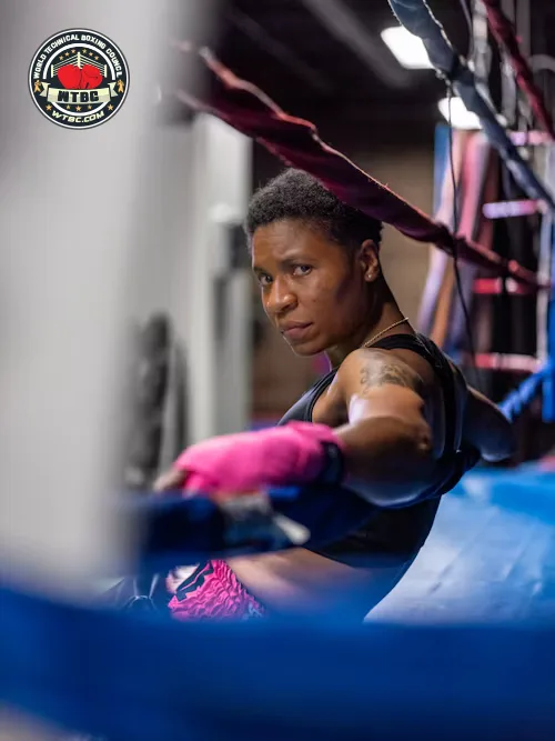
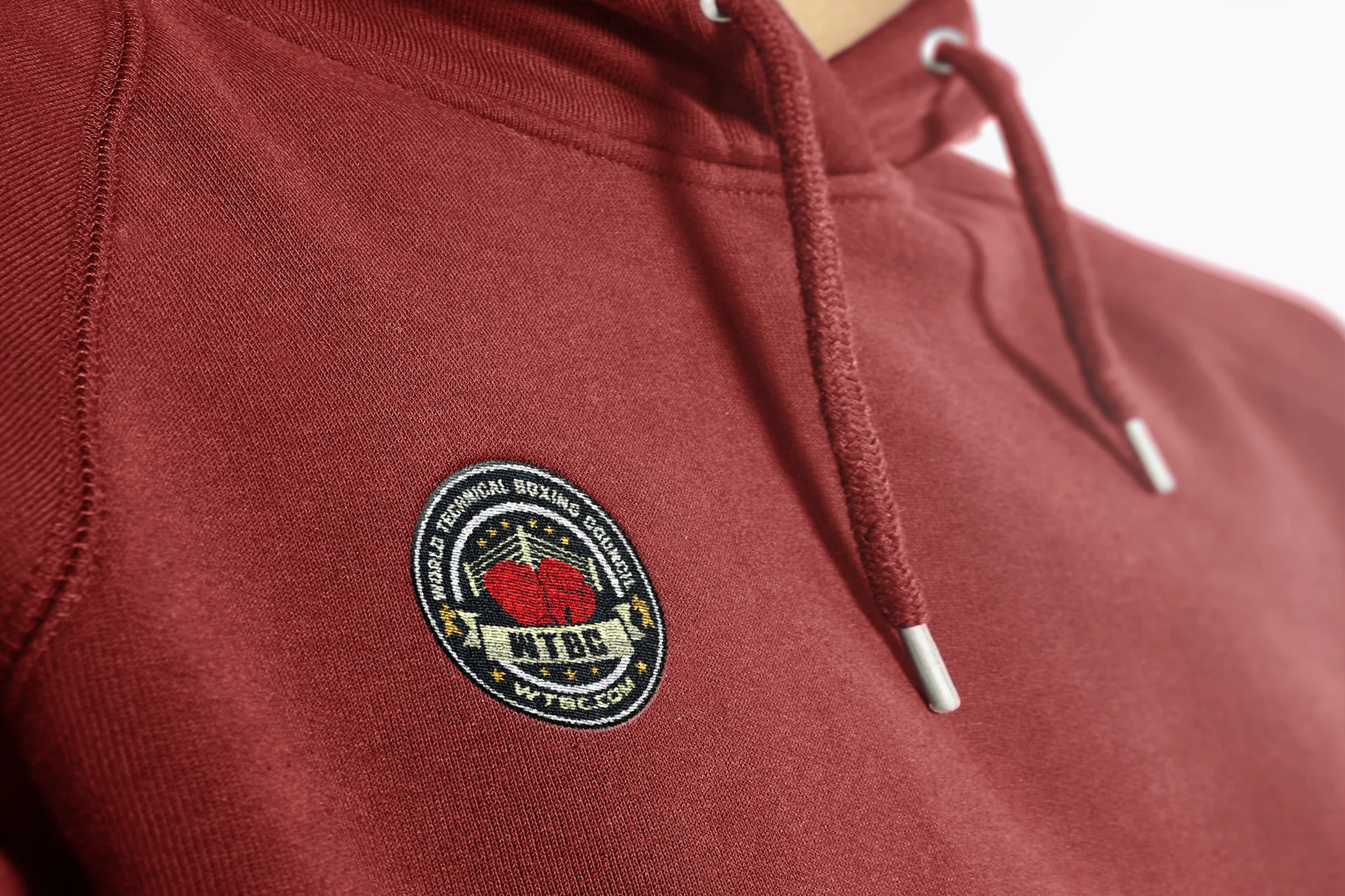
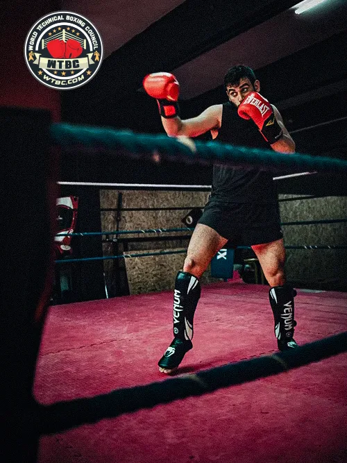
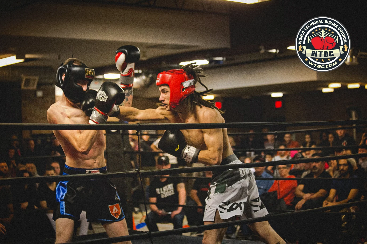
Every application is the same circular master.
One vector master carries all seven applications on this page. Nothing was redrawn for the woven patch, the embroidery or the back print — only a size rule and a colour rule changed.
Four boards, one rule set.
Everything a printer, an embroiderer or an editor needs, written down once.
- 01Central icon — red boxing gloves. Bold, front-facing gloves stand for strength, discipline and the sport itself. They sit in front of a stylised ring, anchoring the mark in combat sport.
- 02Organization name, upper ring. "World Technical Boxing Council" encircles the top, stating the full name in a bold, modern face.
- 03Acronym on the banner. WTBC sits on a ribbon banner, giving the mark a seal-like feel that emphasises the council’s identity.
- 04Silhouetted fighters. Gold fighter icons flank the banner, representing global inclusion and the athlete-centric mission.
- 05Stars and URL, bottom ring. Five gold stars signify excellence, international reach and prestige; WTBC.COM carries online visibility.
 Red boxing gloves
 Gold stars
 Boxing ring behind
 Circular badge shape
 Fighter silhouettes
Book me for a one-off, a full campaign, or a monthly retainer — and stop re-briefing a new designer every time.
mizansyl0607@gmail.com