Case 03

Born to Win Athlete Development Pathway

An identity for a federally recognized nonprofit that guides fighters and coaches from grassroots training to elite competition.

Back to work
Client
Born to Win, Inc.
Year
2025
Scope
Identity, apparel, print
Status
501(c)(3) nonprofit
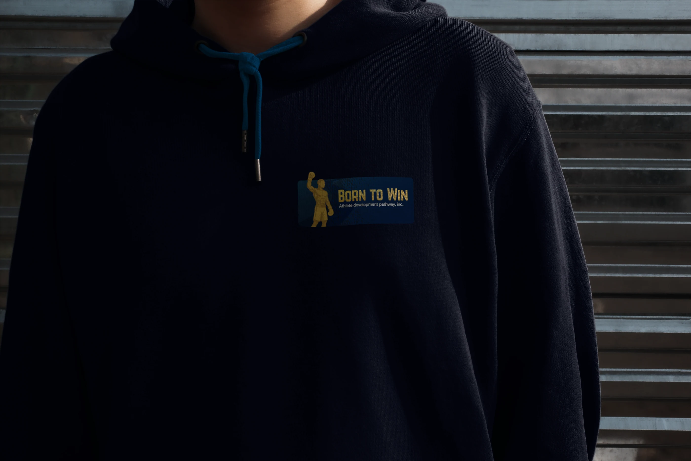
Born to Win plaque printed on the chest of a navy hoodie
Born to Win · Team hoodie, chest plaque2025 · Identity + applications

Born to Win Athlete Development Pathway, Inc. is a federally recognized 501(c)(3) nonprofit dedicated to building a sustainable future for fighters and coaches.

The organization guides athletes through every stage of their journey — from grassroots training to elite competition — by providing structured pathways, safe environments and access to vital resources.

Its mission is to remove barriers, unlock opportunities and ensure every athlete has the tools, education and support to succeed not only in competition but in life beyond the ring.
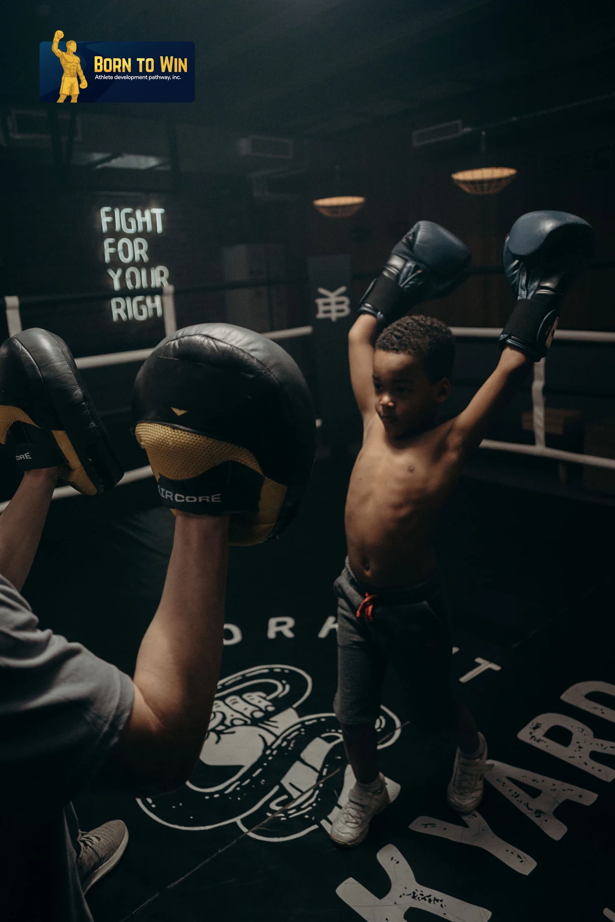

Young boxer with both arms raised after a pad round
01 · GrassrootsFeed · 2 : 3
Boxer resting ringside between rounds
02 · RingsidePlaque bottom-left
Gold raised-fist figure on the navy plaque
03 · The figureOverhang breaks the top edge
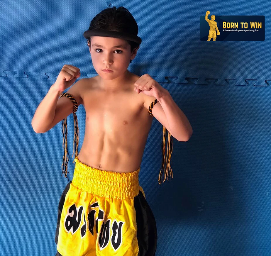
Young muay thai fighter in guard, plaque locked top-right
04 · Pathway intakePlaque top-right
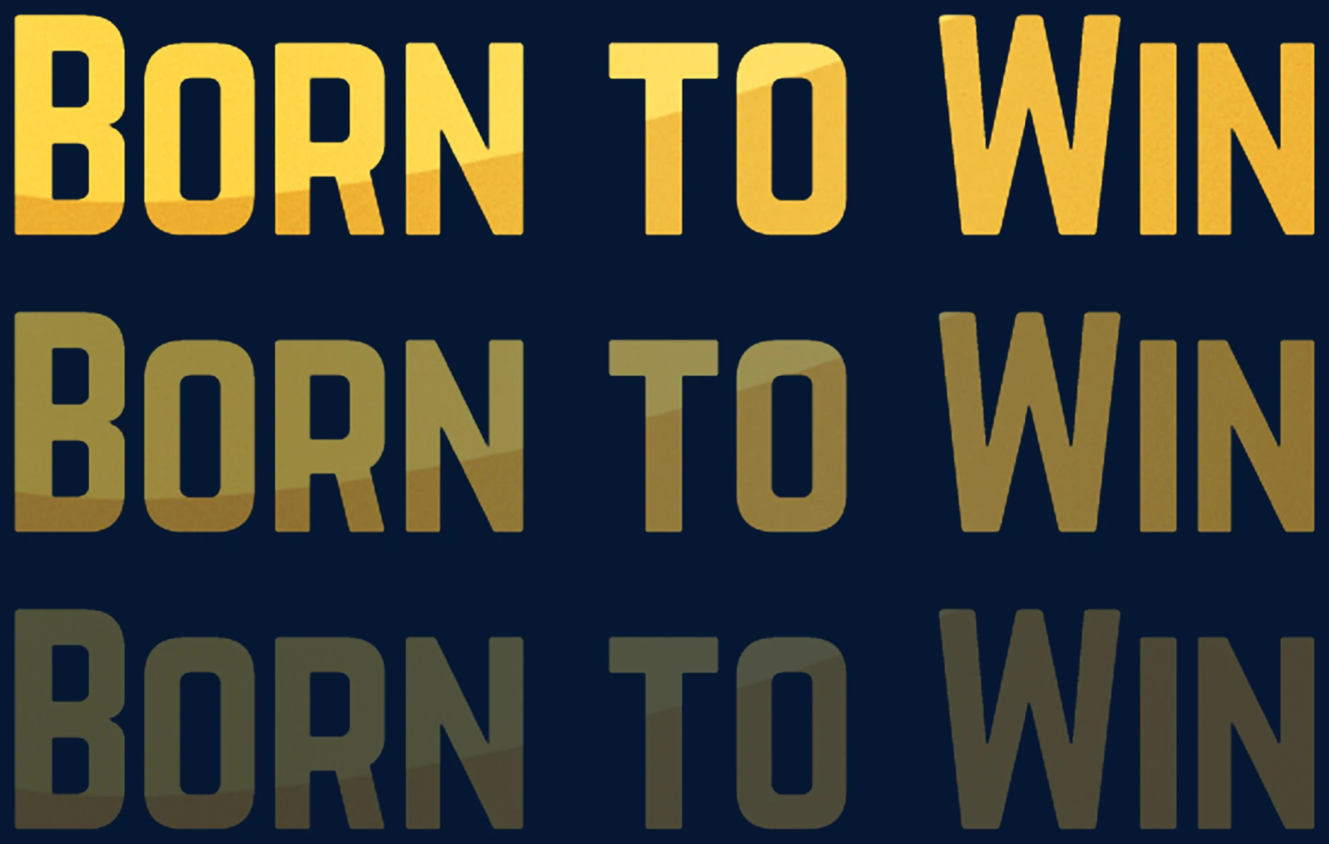
BORN TO WIN wordmark set three times, fading from full strength to 30 per cent
05 · WordmarkGold on navy · 100 / 60 / 30
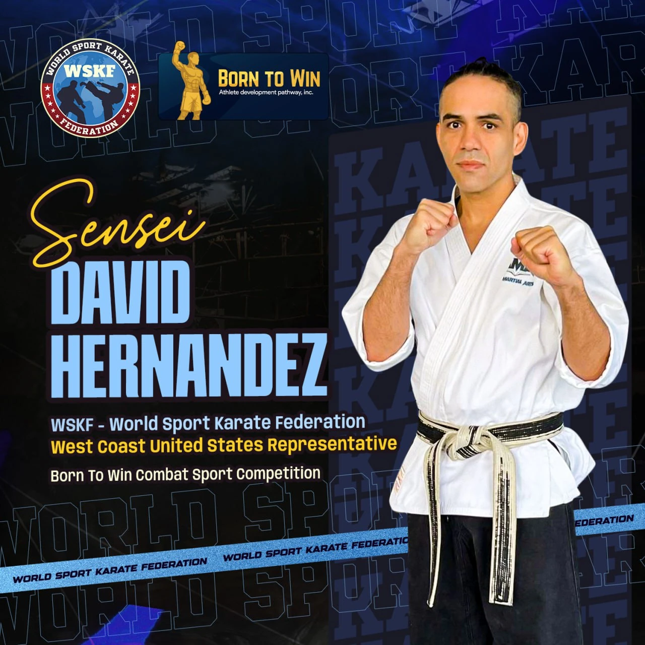
Social post introducing Sensei David Hernandez, WSKF West Coast representative
06 · Representative postPlaque top-right · 1080 sq
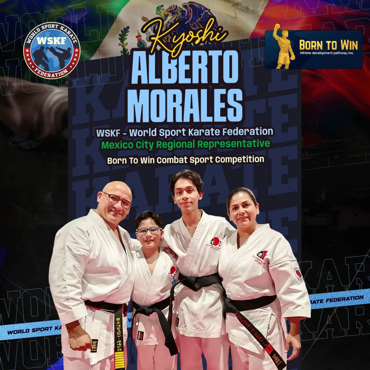
Social post introducing Kyoshi Alberto Morales, WSKF Mexico City representative
07 · Representative postPlaque top-right · 1080 sq
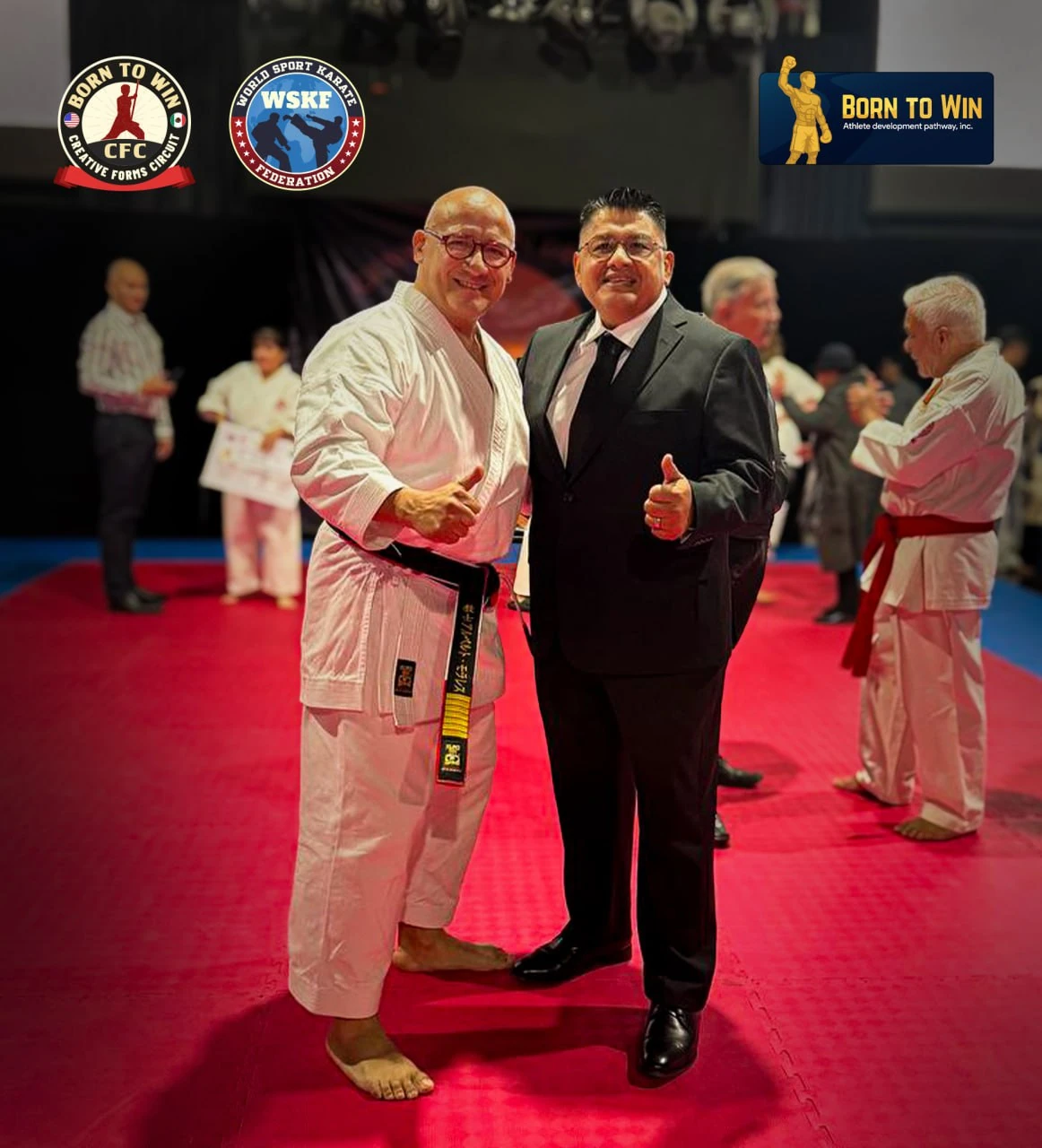
Event coverage post with the plaque locked top-right
08 · Event coveragePlaque top-right · Feed

The figure never changes scale relative to the plaque.

It sits half outside the navy field, so the raised glove breaks the top edge at every size. That overhang is the recognition cue, and it is the one detail that survives at 12 mm and must never be trimmed.

The system behind it

Five boards, one rule set.

Everything a printer, an embroiderer or an editor needs, written down once.

ALogo definition
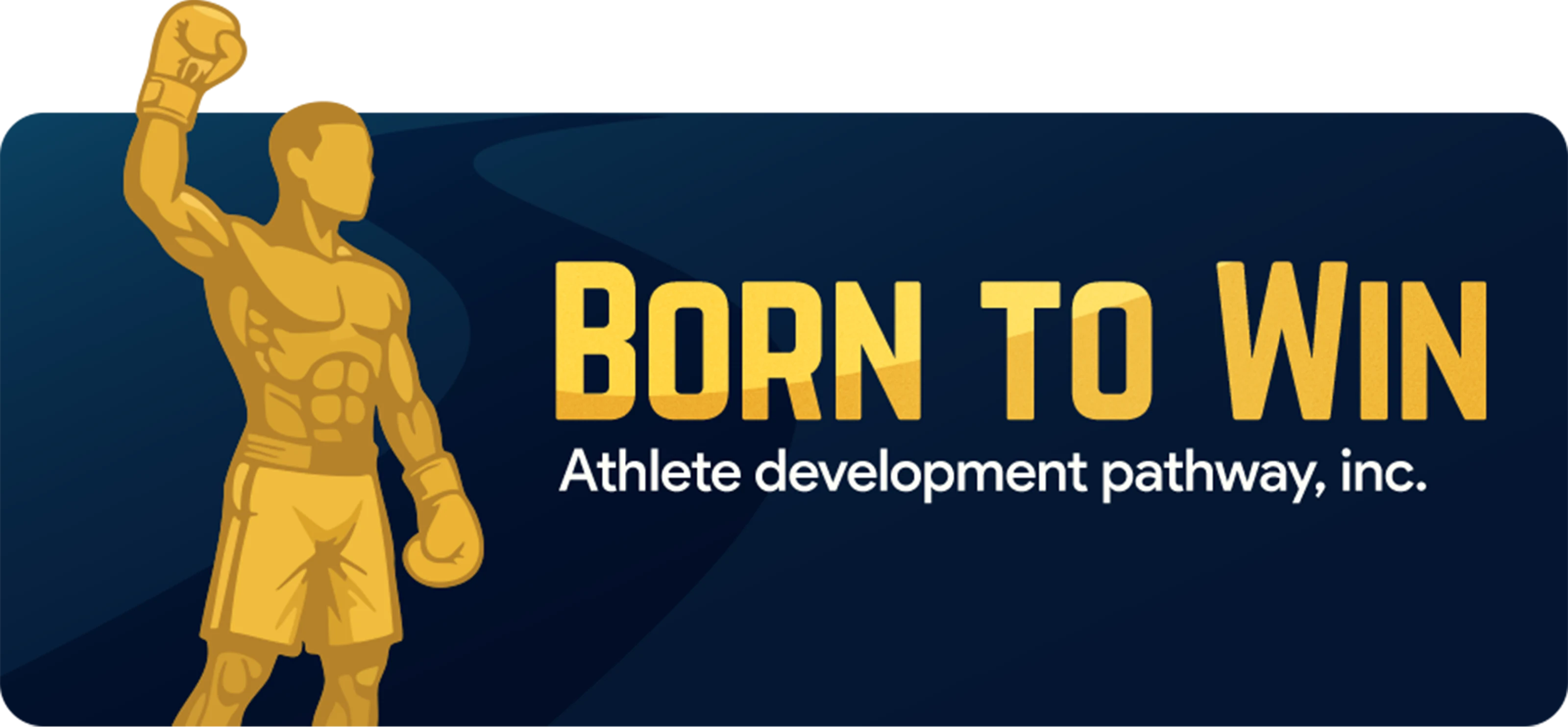
Born to Win, Inc. emblem
  1. 01Raised-fist figure, left. A gold fighter with one glove lifted, drawn in flat planes rather than outline. It reads as the moment after the decision, not during the fight.
  2. 02Wordmark, "BORN TO WIN". Heavy condensed caps with a gold gradient, set tight so the phrase holds together as a single block at small sizes.
  3. 03Descriptor line. "Athlete development pathway, inc." in white, aligned to the wordmark’s left edge. It states the legal name and the remit in one line.
  4. 04Navy plaque. A soft-cornered rectangle with a low-contrast sweep across it. The plaque is what lets the mark sit on photography without a box or a drop shadow.
  5. 05Overhang. The figure’s raised glove breaks the top edge of the plaque. It is the one detail that survives at 12 mm and the one that must never be trimmed.

BColour and meaning
Deep navyThe plaque field. Governance, safety and permanence.#051733
GoldFigure and wordmark base. Achievement, and the only colour allowed to touch the navy.#E4B037
Bright goldHighlight end of the wordmark gradient. Keeps the type from flattening on dark cloth.#FFD547
Off-whiteDescriptor and body text. Warm enough to sit beside gold without going grey.#FFFDF6
CTypography
BORN TO WIN wordmarkWordmark · display
Drawn once, as artwork. Heavy condensed caps with a gold gradient. Never retyped, never re-spaced, never set in a substitute face — the wordmark is a drawing, not type.
Athlete development pathway, inc.Geometric sans · text
One face, two weights. Everything that is not the wordmark — descriptor, mission copy, credentials, captions — so a coach printing a flyer never has to choose a font.
DBrand messaging implications
CredibilityThe navy plaque and the stated legal name do the work a seal would do. A parent reading the card sees an organization, not a gym.
Pathway, not eventThe figure is standing after the round, arm up. It frames the brand around progression through stages rather than a single fight night.
AccessOne horizontal lockup prints on a cap, a hoodie, a card and a banner with no redraw, so a small club can carry the brand at low cost.
Warmth under disciplineGold on navy stays formal, but the rounded plaque corners and the flat-plane figure keep it from reading as a federation badge.
Life beyond the ringNothing in the mark depends on gloves, ropes or a ring. It survives being applied to education, safeguarding and alumni material, which is where the mission ends up.
EBranding elements and their significance
Gold raised-fist fighter figureRaised-fist figure
The athlete, not the sport. Gloves and shorts place it in combat sport, but the pose is a result rather than an action — which is what lets the same figure stand for a first class and a national title.
Navy plaque shapeNavy plaque
A held shape, not a background. It gives the mark its own contrast, which is why it can be dropped onto a dark gym photo or a white banner unchanged.
Navy, gold and bright gold bandsTwo-colour rule
Gold and navy only. No third colour is ever added — event colour comes from photography and apparel, never from the mark.
Available for projects

Book me for a one-off, a full campaign, or a monthly retainer — and stop re-briefing a new designer every time.

mizansyl0607@gmail.com
Contact me